
Web Design Trends for 2013
As a creative director and tech-savvy investor I’m always looking out for the next big thing that will put consumers into a craze. As Apple has been the leader in electronics innovation they are not alone anymore. Samsung has been turning consumers heads their way and away from iPhones and iPads. So as the we close out 2012 what will the tech world have in store for 2013 and how will it affect the way websites are designed. Here is a great article by Jake Rocheleau of Hongkiat.com outlining 20 trends to look out for next year.
All throughout 2012 there has been an enormous surge in new web design trends. Some of you may remember my earlier post on web design trends going into 2012. Now we can see many of these ideas have come to fruition, and even adopted further increasing levels of novelty. In this article I would like to delve into 20 more design trends for the new 2013 year.
The design influence is merely a reflection of our culture and expectations for user interfaces. Ideally these trends represent favorable ideas in the web design community. However designers will always have their own opinions when it comes to design terms, so take these ideas with a grain of salt.
If you are interested, keep your eyes peeled for examples of these trends and techniques.
1. Responsive Layouts
This topic was my first point in the 2012 trend article, however I feel that responsive web design has been changing to ultimately come to a threshold where layouts are designed to match all forms of digital media. The idea is to support all devices from laptops, desktops, smartphones, tablets, and anything released in the future.
You could think of this trend more like a uniform web design where the goal is to have a single set of codes which run perfectly on all environments. Responsive websites are often thought to cater towards mobile browsers, but that isn’t the sole purpose.
You can have a responsive website which also adds brilliant illustrations and graphics into the layout when the browser window is larger.
The big idea here is to think about website design as a single canvas which is dynamic and fluid by nature. CSS3 media queries allow developers to customize layouts based on limited or expanded screen real estate. Use this to your advantage and see how other designers are using it as well!
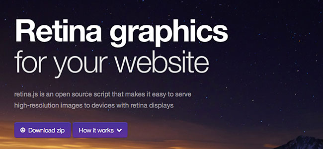
2. Retina Support
Along with responsive support for website layouts I have also seen a dramatic rise in people building for retina devices. Apple first engineered this idea with the iPhone 4 and has since applied this screen display onto their other devices, including the iPad and some MacBooks.
Retina screens are basically twice as dense as any average LCD. So they are the same number of physical pixels, but digitally twice as many pixels can be fitted into the same physical space.
This means pixel-perfect web designers supporting retina devices will need to create two sets of http://media02.hongkiat.com/web-design-trend-2013/. First you need to sample your image at double the resolution, then save a “standard” version at half the size. The larger image will be scaled down to the standard resolution and will look very crisp on retina screens.
One of my favorite tools for responsive web design is retina.js. This is a JavaScript library forautomatically displaying @2x retina copies of image whenever your user is browsing on a retina device.
Although this won’t detect CSS background image, it is still the most handy resource as opposed to coding everything in media queries.
Using the CSS position: fixed; property is a great way to staple a header bar onto your website. As visitors scroll down your page this will offer constant support for navigation and a trip back to the home page. This trend has been around for a while but now we are seeing this in full force.
Fixed headers are so interesting because they can work on practically any website. This includes social networks, blogs, and even design studios or private companies. The design is very trendy and looks great paired with most layouts. But aside from the aesthetics, this bar also provides an exceptional user experience without needing to look very far to navigate the website.